Friday, 30 March 2012
Question 5
 |
| This is a wordle document |
The playground is a location that people with children can resonate with. The storyline can be easily related to by anyone who has had the death of a child as the story line is about a man, who lost his daughter.
To entice our audience we have opened a cinema screening at screen on the green in angel Islington where we played the first two minutes of the film.
Q4 of my media Evaluation "who would be the audience for your media product"
I think the audience for my opening thriller would be aimed at middle-aged females between the ages of 21 onwards because of the location and mis-en-scene.
The location of my opening thriller was in a park where you would normally expect mothers to be playing with their children as it is more commonly known for women to take their children to parks. the image below shows the image of the location of where i filmed the opening of my thriller.
The park below gives off an innocent feel to the opening of my thriller in the beginning.
Another mise-en-scene which shows that the opening of my thriller is aimed at middle aged women is the push-chair which shows up in a few scenes of my thriller. the image below shows the push-chair which featured in the opening of my thriller.
The older male actor would also convey that the thriller is aimed at middled aged women as the older male would symbolise that he has a wife and his own family, this would have an effect on women as it would make them feel sympathy for the father of the child. The image above shows the male actor in the opening of my thriller .
In conclusion I believe that my opening of my thriller is aimed for women but to be specific women aged 21 because I believe that the opening of my thriller is family orientated.
Thursday, 29 March 2012
Q6 of my evaluation- GoAnimate presentation
GoAnimate.com: danielladaiuto's Animation by danielladaiuto
Like it? Create your own at GoAnimate.com
Like it? Create your own at GoAnimate.com
Thursday, 22 March 2012
Question 1 Evaluation
In what ways does your media product use, develop or challenge forms and conventions of real media products?
To answer this question we must first have a look at the conventions of a film opening. Conventions of a film opening change dependant on the genre/sub-genre of the film. These are the general conventions of a film opening although not all films conform
-Production company logo
-Distribution company logo
-Title sequence
-Sound and or video to help entice the audience
-Key characters are introduced
As you can see in our film opening we do conform to these conventions. Although I do feel that the sound could of set the mood of the film a little better.
I have created two scrapbooks using beeclip in which I show the title sequence used by the thriller movie se7en and our own movie Imogen. I did this so that it would be alot easier to compare the two, as you can see our title sequences are very similar although there are some slight differences, but only slight. As well as this in our title sequence the titles are low down so that the audience does not get distracted from the video whilst in se7en we see that the titles are in the middle as the editor wants attention drawn to the titles. In our film opening we obey the conventions of title sequences within films.
To answer this question we must first have a look at the conventions of a film opening. Conventions of a film opening change dependant on the genre/sub-genre of the film. These are the general conventions of a film opening although not all films conform
-Production company logo
-Distribution company logo
-Title sequence
-Sound and or video to help entice the audience
-Key characters are introduced
 |
| Production company logo |
 |
| Distribution company logo |
I have created two scrapbooks using beeclip in which I show the title sequence used by the thriller movie se7en and our own movie Imogen. I did this so that it would be alot easier to compare the two, as you can see our title sequences are very similar although there are some slight differences, but only slight. As well as this in our title sequence the titles are low down so that the audience does not get distracted from the video whilst in se7en we see that the titles are in the middle as the editor wants attention drawn to the titles. In our film opening we obey the conventions of title sequences within films.
EVALUATION: Q7
EVALUATION: Q7
Looking back at your preliminary task, what do you feel you have learnt in the progression from it to the full product?
I have created a clip on GoAnimate to demonstrate the skills which I have learned both during and after my preliminary project -EVALUATION: Q5
EVALUATION: Q5
How did you attract/address your audience?
For this question I have created a short movie on Final Cut Pro to demonstrate what aspects of my film -including mise-en-scene, actors, location and film title - might appeal to my target audience.
I am now going to compare my final film to my rough cut edit. My rough cut was extremely unorganised, and had my final film been in any way similar, it wouldn't have been a good outcome. The rough cut had no sound; had no titles; had clips which weren't in the correct order and had gaps in between each clip. The advice my teacher gave me was extremely useful because she was able to point out mistakes and areas for improvements. In relation to how my film appeals to my target audience, this was important because it made the film better and allowed it to flow more, and a film which flows nicely and makes sense appeals to an audience much more than a film which doesn't.
So far, I have reached my audience through vimeo, through the cinema screening of my film, through facebook and the film would eventually go on to be released on DVD and would be displayed at independent film festivals in London, such as London Short Film, FrightFest, Raindance Film Festival and BFI.
So far, I have reached my audience through vimeo, through the cinema screening of my film, through facebook and the film would eventually go on to be released on DVD and would be displayed at independent film festivals in London, such as London Short Film, FrightFest, Raindance Film Festival and BFI.
EVALUATION: Q6
EVALUATION: Q6
What have you learned about technologies from the process of constructing this product?
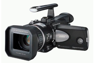
The two most important technologies which I used were Final Cut Pro and the JVC Camera, because without either of these products I wouldn't have even been able to create the first stage of my media product. I used other, less important technologies along the way (such as the iPAD 2 for research and flip cameras for filming evaluations amongst other things) and they were important for me to produce my thriller film, however they weren't crucial like Final Cut Pro or the JVC Camera.
Before this course I was entirely unfamiliar with the JVC Cameras and Final Cut Pro, and so it was important for me to understand how to use these products before producing my film so that I was skilled enough to make it look decent. I enjoyed learning about the camera and the editing software because it was a new skill I learned which was an important aspect of the project.
EVALUATION: Q4
EVALUATION: Q4
Who would be the audience for your media product?
My thriller film was originally targeted at 15-24 year olds, however since the development of the opening and the style of the final product, it seems much more appropriate for it to be aimed at a more mature audience. Although the film would still be rated 15, I don't think younger teenagers would be interested in watching the film because no aspect of the film relates to teenagers - it deals with a man who has lost his child and is attempting to cope with his grief. My new target audience would be 21+, because they are old enough to understand the mature themes within the film and also may have children of themselves, so they are more likely to be enticed by the themes of the thriller.
After showing the rest of my class the final product, we all agreed that not only was it aimed at more mature people, but it also would appeal to the female gender more. This is because men are more interested with thrillers which are either fast-paced, such as action and crime thrillers, or those which have elements of horror in them too, because gore tends to attract males more than females. Our film does not encompass these elements, and so it would appeal to females more.
I created a questionnaire as a way of discovering what people thought of my film opening. Here is a short powerpoint movie to show my results -
EVALUATION: Q3
EVALUATION: Q3
What kind of media institution might distribute your product and why?
question three on Prezi
I have created a small prezi document to present this question. It encompasses the names of the production and distribution companies of my thriller opening, and explains that these companies are small independent companies, unlike major companies used to produce/distribute major, popular films.
As I have used THE SECRET WINDOW as a comparison before, I will use it again to show the differences in companies. For example, major companies will not only have their name titles, but also their company logos. For example -
My own thriller has a production company logo as well, but the production name does not come up twice. Instead, we see 'Premiere Films 7', the distribution company.
I have created a small prezi document to present this question. It encompasses the names of the production and distribution companies of my thriller opening, and explains that these companies are small independent companies, unlike major companies used to produce/distribute major, popular films.
As I have used THE SECRET WINDOW as a comparison before, I will use it again to show the differences in companies. For example, major companies will not only have their name titles, but also their company logos. For example -
 |
| PRODUCTION COMPANY LOGO |
 |
| PRODUCTION COMPANY TITLE |
EVALUATION: Q2
EVALUATION: Q2
How does your media product represent particular social groups?
I have created a couple of collages on beeclip to show my understanding of different representations of social groups. For example, I took one social group - 'teenagers' - and looked at three different ways in which they are represented by the media. The first representation that I looked at was the wild, uncontrollable side of youths. It shows them to be constantly partying, engaging in sexual activities and just generally being out of control. The second representation that I looked at was the depressed side of teenagers, in particular young women, and the third was looking at the sub-culture label of 'chav', showing teenagers to be no good for anything, trouble-making and intimidating. All of the representations of teenagers are negative, which is a common stereotype used for teenagers by the media.
Although my own film did not focus on teenagers, I found this analysis useful for reinforcing the notion of stereotypes used in films and in other media. My own film opening looked at a man dealing with the loss of his young daughter. This is an interesting representation because it shows the man as weak and vulnerable, whereas men are stereotypically represented in the media as strong and tough, not being stumped by emotional difficulty. It is usually women who are shown to be vulnerable, and so we have challenged general media stereotypes.
Monday, 19 March 2012
Q1 of evaluation
The opening of my thriller 'imogen' target audience was aimed for the ages of 21+. This target audience was chosen because our film is based around the lost of a child and the father is grieving, also the audience for our film 'imogen' is also aimed women.
My opening of my thriller will be shown below and I will take clips of our opening and analyse how the conventions have been followed.
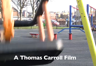 The conventions of the titles have been followed as the production company logo came first which was shown at 00.15 secs in our opening which usually comes first in the openings which is then followed by the production team which shortly followed by the main actor which is shown to the right. the main character of the film in our opening of our thriller was shown at 00.38 seconds.
My opening of my thriller will be shown below and I will take clips of our opening and analyse how the conventions have been followed.
 The conventions of the titles have been followed as the production company logo came first which was shown at 00.15 secs in our opening which usually comes first in the openings which is then followed by the production team which shortly followed by the main actor which is shown to the right. the main character of the film in our opening of our thriller was shown at 00.38 seconds.
Evaluation Question 4
This photograph shows what age group of people go to watch thriller films. As we can see people aged 15-30 are the most likely to go and watch a thriller film. I extracted this information from a reliable forum in which users were asked their age and which film type they most liked.
The sub genre for my film is crime which is predominately watched by men as they often involve violence justice system and villains. Although in recent years woman have been drawn into crime with the escapism element it entails.
 |
| Target audience |
EVALUATION: Q1
EVALUATION: Q1
In what ways does your media product use, develop or challenge forms and conventions of real media products?
Film openings often follow certain conventions to convey meanings or messages embedded within the films, or they challenge conventions to propose new ideas or notions. Conventions can exist within different genres and sub-genres. For example, the conventions used in horror films are different to the conventions used in comedies.
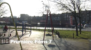
The screen grabs above are taken from my own film opening. They are quite bright and light in comparison to the ones in ARLINGTON ROAD; this was a device we used to lull our audience into a false sense of security. We wanted the opening of our film to be quite positive in contrast to the creepy music in the background and the revelation of the death at the end. The contrast in film opening title sequences (between ARLINGTON ROAD and IMOGEN) is also down to the fact that ARLINGTON ROAD uses a stylised title sequence, with distorted colours and images to add to its thriller genre.
Above is the first ten minutes of THE SECRET WINDOW, a psychological thriller, however I am only focusing on the title sequence. My own opening is very similar to this opening in that, similar to ARLINGTON ROAD, the titles come up over footage and not a blank screen. This is important because it shows you what the film is going to be about - for ours, our titles came up over shots of a park, suggesting that there will be something to do with a child. Similarly, in THE SECRET WINDOW, the titles come up over the house, a place which comes to be very important to the film's plot.
Other conventions of film openings are the positions of the titles within the film. In my own opening, the title, IMOGEN, comes up at 0:49 seconds. The length of my own title sequence is 1:39 seconds, so the title is right in the middle of my opening. This follows conventions because to have it too late during the title sequence is not conventional, as the film title is one of the most important titles a film will have. Other conventions of film titles show contrast between my opening and the opening of THE SECRET WINDOW; THE SECRET WINDOW stars Johnny Depp, a famous Hollywood actor. Because of his fame, his name is shown early on in the titles before the actual film title as a marketing tool, enticing Depp's fans in. Because my own film is produced by a small independent company and does not, therefore, star any famous actors, our main actor 'Aaron Meller' comes up after the title and quite far into the title sequence.
The screen grabs above are taken from the thriller ARLINGTON ROAD. We have followed very similar conventions used in these titles; we have our titles come up over footage instead of having them appear over a blank screen; they are over clips of significant things instead of characters (for example the house and the swings). We also followed conventions by starting off with our production and distribution company titles, before anything else.

The screen grabs above are taken from my own film opening. They are quite bright and light in comparison to the ones in ARLINGTON ROAD; this was a device we used to lull our audience into a false sense of security. We wanted the opening of our film to be quite positive in contrast to the creepy music in the background and the revelation of the death at the end. The contrast in film opening title sequences (between ARLINGTON ROAD and IMOGEN) is also down to the fact that ARLINGTON ROAD uses a stylised title sequence, with distorted colours and images to add to its thriller genre.
Above is the first ten minutes of THE SECRET WINDOW, a psychological thriller, however I am only focusing on the title sequence. My own opening is very similar to this opening in that, similar to ARLINGTON ROAD, the titles come up over footage and not a blank screen. This is important because it shows you what the film is going to be about - for ours, our titles came up over shots of a park, suggesting that there will be something to do with a child. Similarly, in THE SECRET WINDOW, the titles come up over the house, a place which comes to be very important to the film's plot.
Other conventions of film openings are the positions of the titles within the film. In my own opening, the title, IMOGEN, comes up at 0:49 seconds. The length of my own title sequence is 1:39 seconds, so the title is right in the middle of my opening. This follows conventions because to have it too late during the title sequence is not conventional, as the film title is one of the most important titles a film will have. Other conventions of film titles show contrast between my opening and the opening of THE SECRET WINDOW; THE SECRET WINDOW stars Johnny Depp, a famous Hollywood actor. Because of his fame, his name is shown early on in the titles before the actual film title as a marketing tool, enticing Depp's fans in. Because my own film is produced by a small independent company and does not, therefore, star any famous actors, our main actor 'Aaron Meller' comes up after the title and quite far into the title sequence.
Evaluation Introduction
Over the next few weeks I will be working on my evaluation for IMOGEN, encompassing my answers to 7 questions represented in a visual way, using different media products. In my answers to these questions I will analyse several different aspects of my film opening, such as the conventions of film openings; the target audience of my thriller; the technologies I used; what I have learned overall.
None of these questions ask me to evaluate my film opening in an overall way, and do not ask me how I think my film opening went overall. For this reason I thought a quick blog to introduce the evaluation process would be appropriate, in which I will explain how I think my film opening went in my own words, without attempting to answer any formal questions.
I think IMOGEN was an overall success, and I think that the final product went better than it could have done. This is because I don't think we had an extremely secure idea, and I think that our idea could have either been really good or really bad. As it stands, I think it turned out to be somewhere in the middle. I think it achieved its genre of psychological thriller and reflected the hard work we all put in as a group.
Tuesday, 6 March 2012
09. Karen, Joshua, Anisha, Mohammed from
As part of my media studies course I am going to evaluate some film openings from previous students at my college.
I think that this film opening works very well because it creates a false sense of security as it seems like the main character is having a normal day, this is very similar to what we are going to do in our film opening (creating a false sense of security) this is why I believe we can incorporate some of these ideas into our own film.
I also think that this film opening works well as it is simple yet effective, they also did well in keeping the identity of the person who posted the letter a mystery.
this person has also added foley sound into their film opening making it sound more attracting to the audience
My evaluation on rough cut of editing
I think the rough cut of the the edited 'Imogen' is good although there were a lot of sequences that were missed out due to the fact that this was our first attempt at blogging. We used miniml effects in the rough cut to give the audience the idea of what our film will look like, these effects were the colour tint and the layering two sequences together so it looks as if the two sequences of the opening are mixing in with each other.
I think what could be improved in the rough vut of our editing is more clear sequences which would make the whole opening look more clearer to the audience and i think we should aim to make the rough cut a bit longer in length to give an idea to the viewers what our film is going to be about .
I think what could be improved in the rough vut of our editing is more clear sequences which would make the whole opening look more clearer to the audience and i think we should aim to make the rough cut a bit longer in length to give an idea to the viewers what our film is going to be about .
Thursday, 1 March 2012
Rough Cut of Imogen
This is our rough cut of our final film opening. We were slow on getting the editing running smoothly and so our rough cut is only the first few clips of the opening and not the opening as a whole. There are also black gaps in between each clip, the first is to mark where our movie title will appear (IMOGEN) and the following ones are to remind us that we still need to include transitions between our clips. We also need to mute our clips.
Our teacher, Rebecca, gave us some tips to help us with our editing process. The following is a list of things we need to work on -
- plan on paper the rest of your sequence
- edit the clip of the roundabout (person and tripod visible in background)
- limit amount of layers used in clips
- plan where your titles are going to appear
- reduce the lighting in your clips
In response to what feedback our teacher has given us, we are more prepared and know what we need to do over the next week to get our opening completely finished. We have decided not to stick to our storyboard as we feel that the opening works better and is more creepy in a completely different order. For this reason, like Rebecca said, we need to plan the rest of our sequence in more detail so that when we next edit we aren't spending time worrying about what is going where.
Subscribe to:
Comments (Atom)


